Application management tool
Self Service Application
COMPANY
HCL
ROLE
UX Designer
EXPERTISE
UX/UI Design
YEAR
2024
Overview
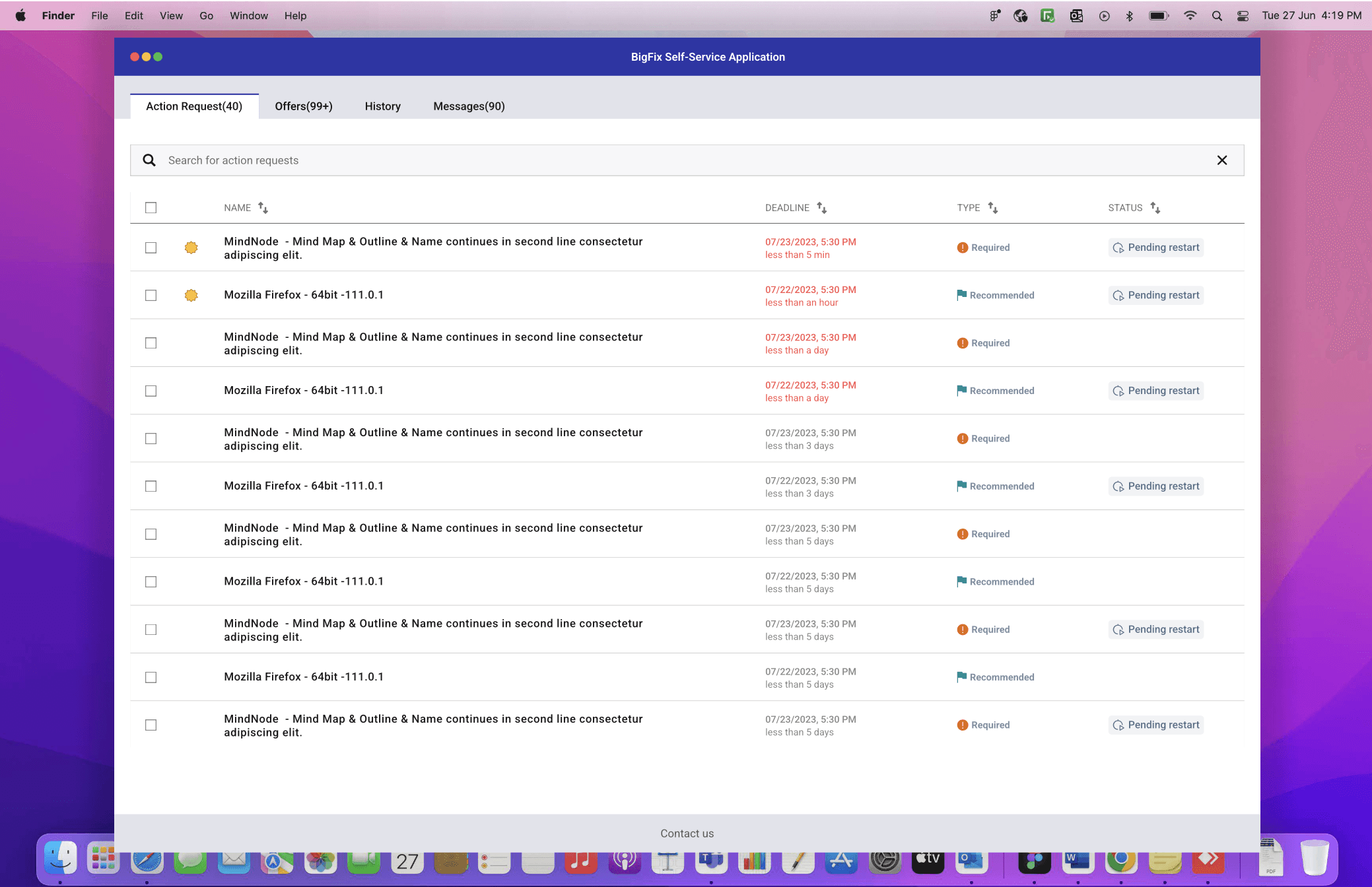
SSA is a simple and powerful application that allows users to download applications from the catalogue without requiring administrative privileges.
It is a companion app to BigFix. To deploy, admin must launch a single fixlet from the console. It will trigger in endpoint and be installed as a standalone product.
The SSA app can be customised by the user, including the brand, colours, and name.
To deploy any application, the user must first navigate to the BigFix console, locate relevant applications, and pick endpoints.
Background
The app seamlessly integrates with your existing SSA app, using advanced algorithms to prioritize Action , Offers & other stuffs.
Problem
To Support multi-selection of actions with deadline in order to cancel, take or postpone them.
Assumptions:
User can land on the catalog page, either by clicking on the notifications.
User can directly open SSA & land on catalog page.
User cannot postpone an offer or a required notification that has reached the deadline.

Tools
Figma, FigJam board, Balsamiq Color contrast checker
Team
2 UX Designers, 6 Developers, 1 Product manager
My role
UX Design, UX research, Visual design, Interaction design
Timeline
Overall 10 weeks - Research 2+ weeks
Process
Analyse
Explore
Implement
Feedback
Interview - Stakeholders
Gathering data from businesses is more significant because it provides more insight into why they need this product in the first place.
"To eliminate the need for administrative resources to manage SSA
"More user engagement if we polish the best UX strategy that is simple to use"
"There is no requirement for a system administrator; end users can setup their systems directly"
"Can market the product with more confident & improve sales ratio"
" Able to use less resources - ultimately save extra expenditures.
Interview - Users
During this phase of the project, I conducted user interviews to build new personas and to inform the design. Together with the team, we prepared few interview questions focusing on our target audiences’ values, motivations, and daily routines. In 5 days, I recruited and interviewed 5 users remotely. We referenced the user interview findings throughout the entire design process.
Users have expressed " showing the things that are important to me & let them to see easily & quickly"
Users wanted " The interface & navigation to be made more intuitive & user friendly".
High cognitive load - No breathing space
UI doesn't look polished
No difference between offers and action requests - clubbed together
No grouped notifications - Finding difficulties to categorise
Personas
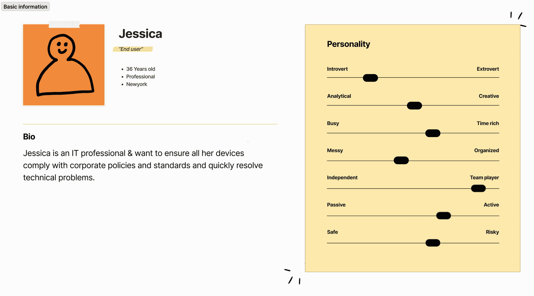
We aimed to gain a better comprehension of the objectives, requirements, experiences, and behaviours of our users. For each of our user segments, we therefore produced two personas. They were updated during the project as new data was gathered, and they were based on user interviews and surveys. Whenever we wanted to move outside of ourselves and reevaluate our initial thoughts, we would adopt these identities.
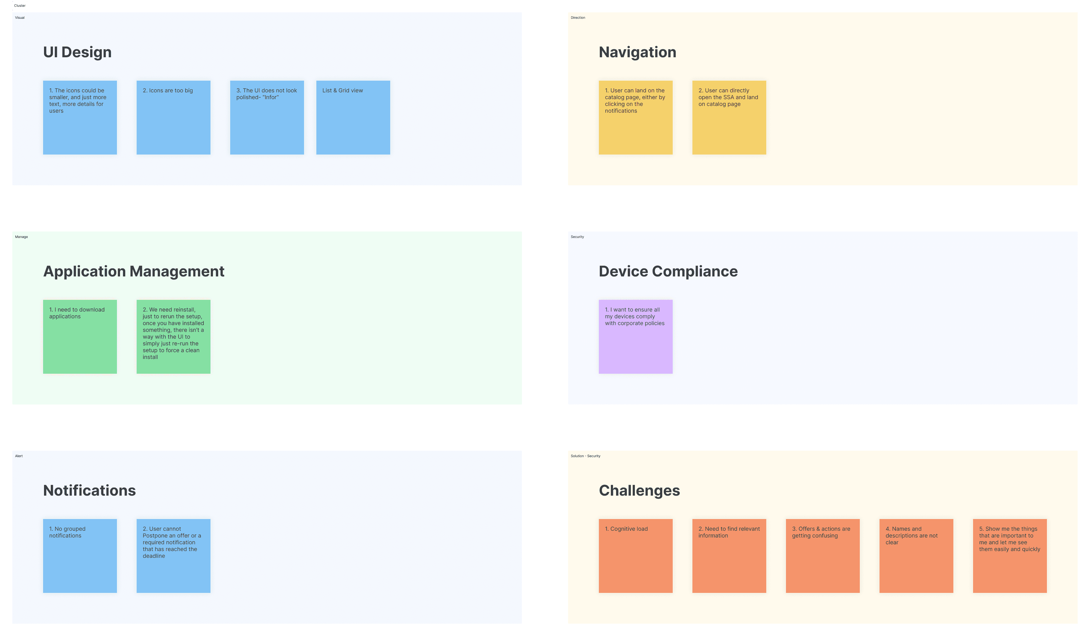
Affinity Mapping
Identify similar patterns to figer out features and challenges to overcome
User Journey
Maps out steps, interactions, emotions, and pain points users encounter.

What can we do?
Have a single view.
Separate Action request from Offers.
Categorise action request as required, suggested and others. (Technical challenges)
Under offers use categories to group the offers (Category is a custom field, not sure if this is helpful)
Have a global search (Techincal challenges)
Have the primary call to action next to each item, the next course of action will be similar to what we already have in SSA
These are patterns from existing application like apple store, google drive and hence users are familiar with it, reducing learning curve for our users.
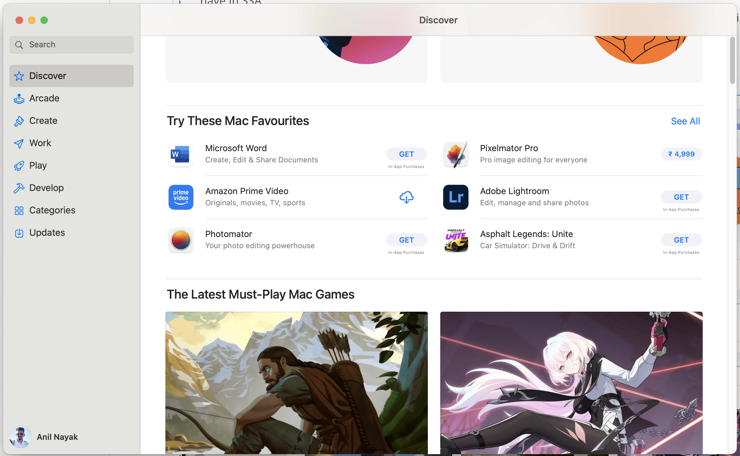
App store analysis.
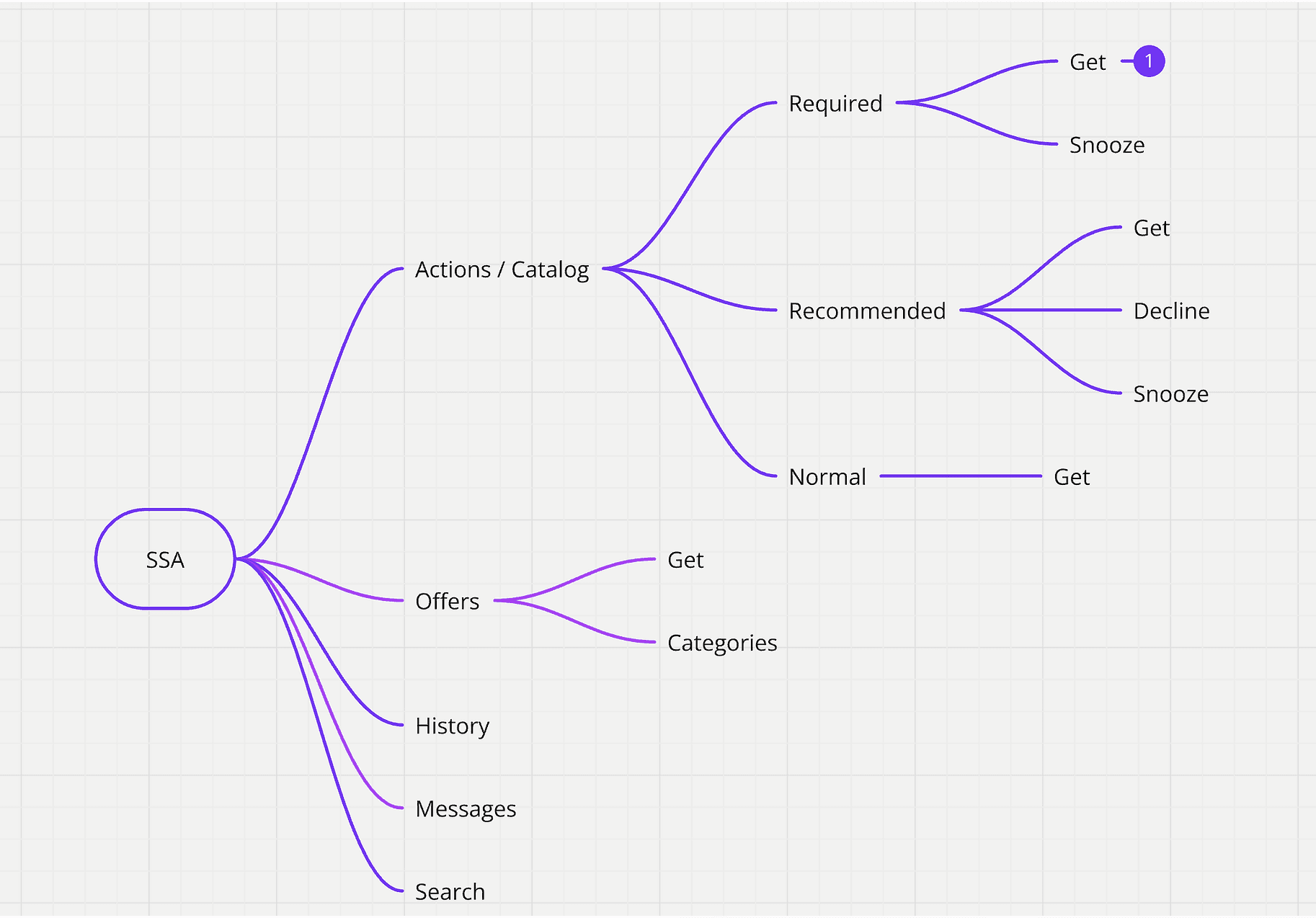
High level - Mind map
Identify & mapping out information Hierarchy
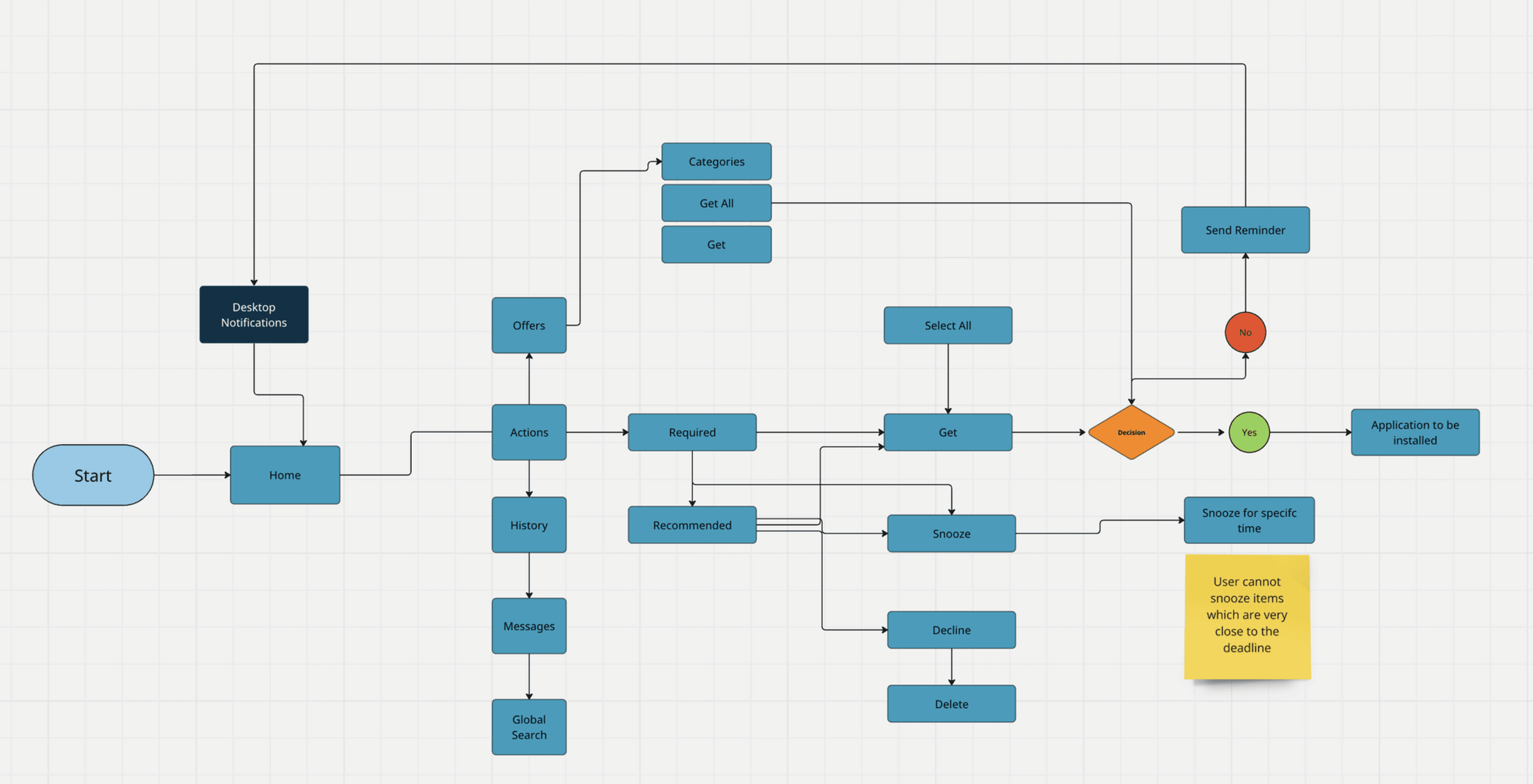
User Flow
Visual representation of how the user moves through the application and shows what happens at each step along the way
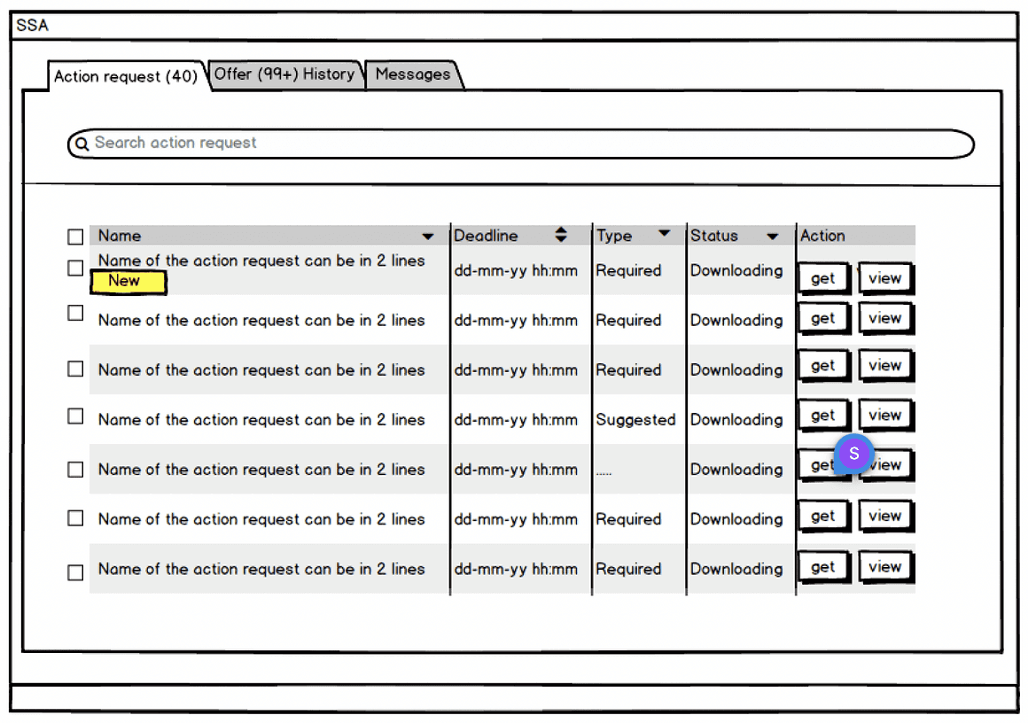
Wireframes
I then started to construct the preliminary drawings, which show the application's structure. Few user testing sessions allowed for the adaptation of feedbacks and inputs.
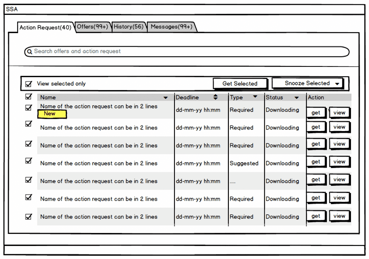
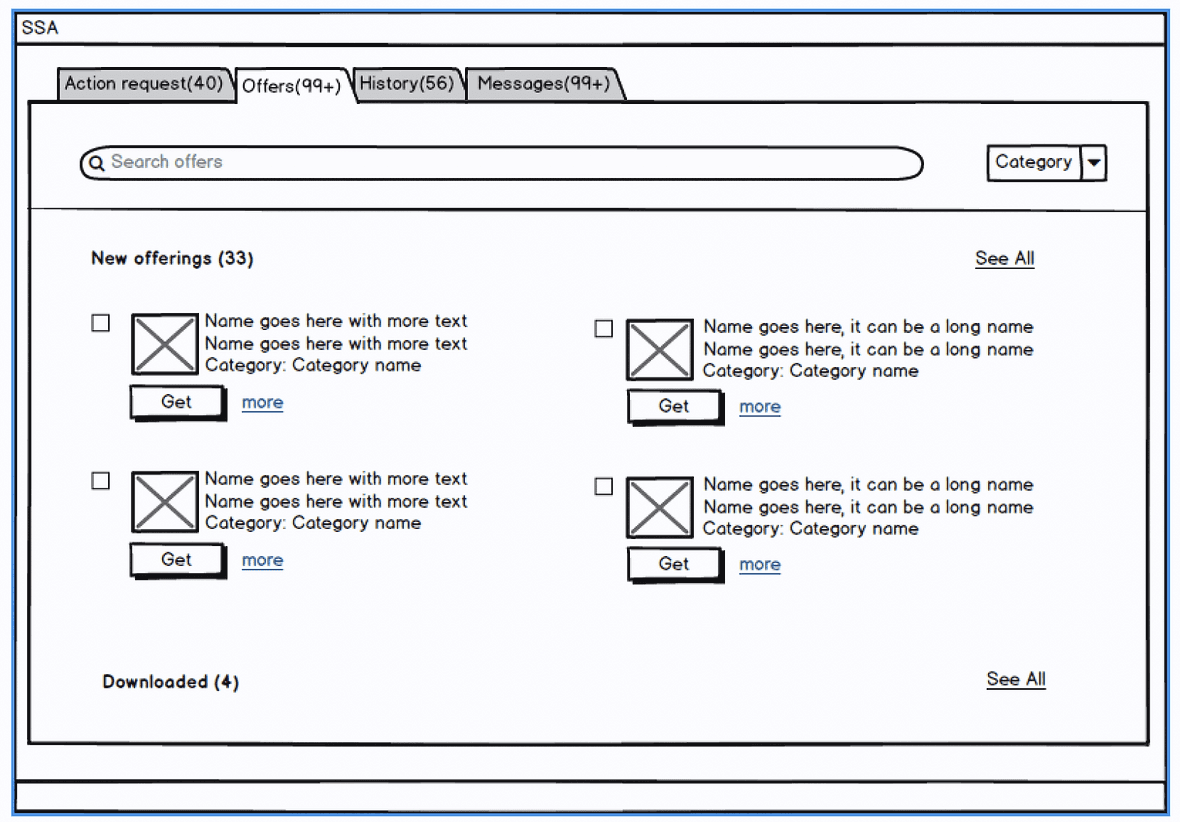
Visuals - HiFi mockups
Final look & feel - Design system
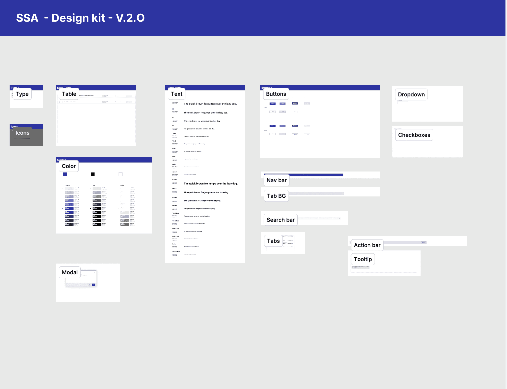
Action Request
All actions deployed shows here

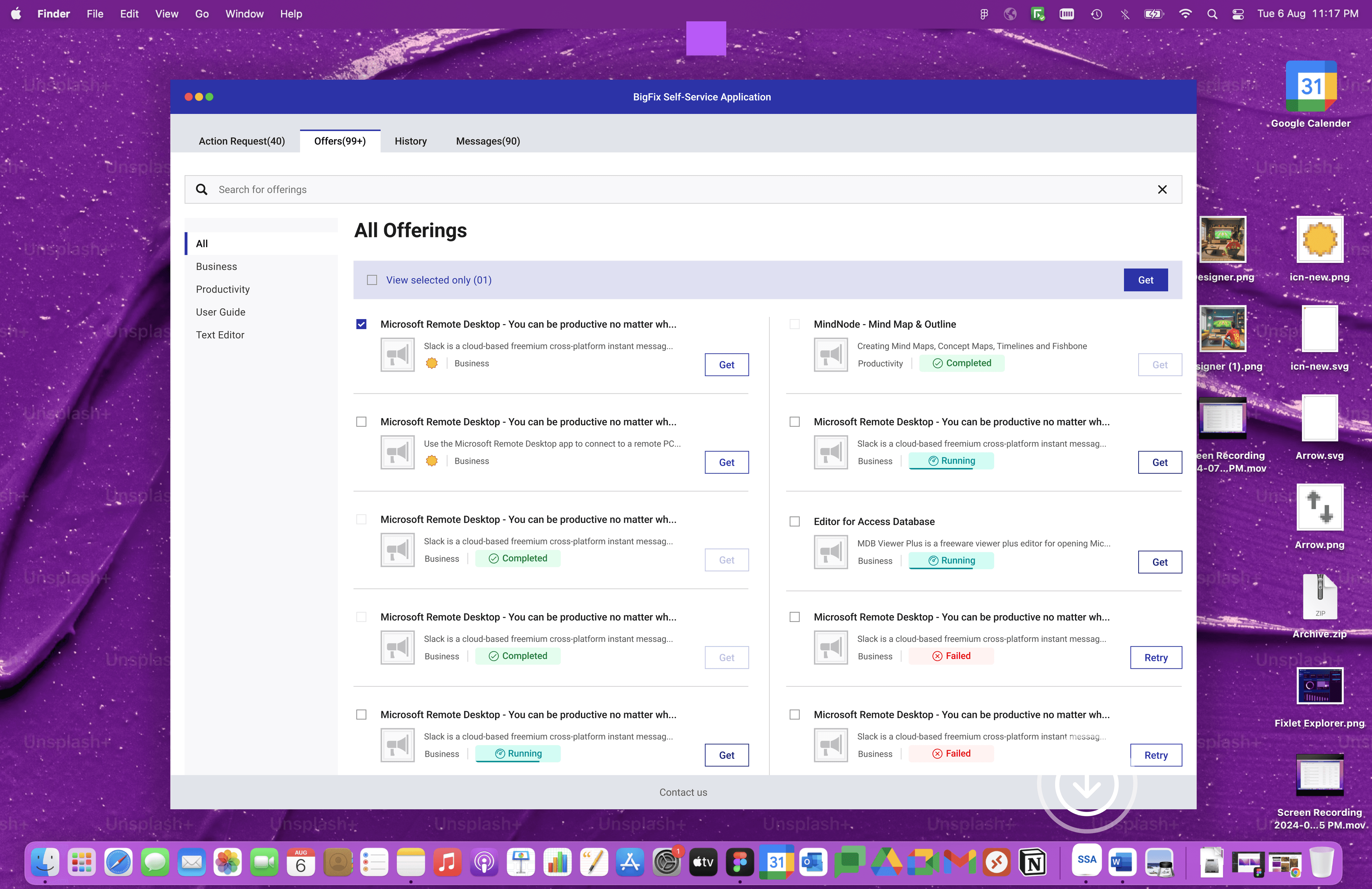
Offers
Offers can be displayed by different categories to easily findout.

Offers
Take quick actions on available offers
Action Request
All actions deployed shows here
Actions Request
User can Run, Snooze & decline based on the dedaline.
